7/7/15
Journal
My earliest memory of “making art”, happened when I was in the second grade. I was attending my weekly girl scout meeting. This week we were visiting a pottery shop. The pottery shop had a section for instruction for adults and children, where they could create their own pottery and be able to get it baked in the oven for future use! I learned that the “oven” is actually called a kiln. I created a very uneven bowl, with lots of star clay shapes pressed into the bottom. I wanted to give the bowl to my mother, so I wanted it to be perfect. At the time I thought it was and my mother still has the bowl (for display use, not for actual use) today!
Studio Work, Journal Response
The two paper objects I chose to work with, were a granola bar wrapper and a sticky note. I find it especially challenging due to the lack of other materials we’re allowed at this time. Not having anything adhesive is a struggle for me. With this is mind, I tied the wrapper in a “bow tie” kind of formation. To add on, I took the sticky note, ripped it into pieces and was able to stick it on the electric bow tie.
My goal when creating this piece was to come up with something different and creative- not necessarily knowing what my outcome would be.
Media becomes communication once its transformed from its original idea or intent. Even if a piece of paper has writing on it, it has transformed- it has “done its job” by providing the artist with something else than the original blank space it once had.
First attempt with paper, creating a “Nightmare” frame.

Granola Wrapper & Name Tag, Second attempt with paper

Classmates work with paper


Collage
7/13/15
Journal
Other works in class: 


I found many of the collage prompts, tempting with multiple different interpretations. I was able to finish all three collages, with similar use of mixed media and prompt. I love using magazines and pictures to depict different imagery and illusions. I find it fascinating, being able to manipulate different parts, words and textures together to create different meanings. Some of the difficulties I faced during this process was simply finding pieces that would work with the image I had in my head. Trying to find and manipulate things through an external media is often difficult and hard to piece together. With this being said, I also stumbled across things I could manipulate in a different way, that worked with the same purpose.
1. Depression: This particular work came very easily to me. As soon as we received a prompt with the opportunity to showcase feeling or mood, I had a clear vision of how I wanted to portray the feeling of depression. The front girl, has a transparency dropped over here, surrounded by the cooler colors to the observer a sense of sadness and worthlessness. The women around here, with the background are the opposite, but also have restrictions among them. One being emotion, another being speech, the third being vision. This gives the observer the imagery of “it’s not always as it seems” illusion.

2. Time: Searching throughout the magazines, I stumbled across a giant advertisement for a watch. In my current reality, there are a lot of factors related to time, especially in my 20’s. I wanted to show a spectrum of time and events. The top starts with an infant with the word “younger” spelled above it. As the observer’s eye travels along the right side of the piece, the infant or child becomes older, showing a teenager, a married couple and then finally aging people. The watches or other clocks on the left side of the piece show how time is endless, and repeats itself everyday, regardless of the person or situation.

3. Perfect: This collage was constructed to showcase the imperfection of society and how we view beauty. This woman is made out of all different models and “perfect” images. Together she is mismatched and debatably ugly. This idea of self image and body imperfection our society has is ugly and quite frankly wrong. In order to show this, her mind is empty, with an empty cloud above her head. She is “perfect”.

Teaching Collage
Two artists I found inspirational, or gave me a different perspective are…
Shamekh Al-Bluwi: An artsist in the fashion industry who uses landscapes as inspiration for clothing. Putting these two different concepts together, is an unlikely pair, which is fascinating in terms of “collage”. I feel like I could use this artist in the classroom with his works done on pop stars such as Taylor Swift, gives a relationship between students and their learning.
http://www.mtv.com/news/2210022/taylor-swift-outfit-cutouts-nyc-1989-tour/
https://instagram.com/shamekhbluwi/

Sarah Eisenlohr: Her collage work gives the observer a type on escape, a very “Alice in Wonderland” feeling. She uses different patterns and different parts of nature to convey an idea or an illusion. I love her work because it keep the overall portrait or landscape, but changes the meaning of the image.
http://blog.freepeople.com/2013/02/artwork-love-collages-sarah-eisenlohr/

7/20/15
Studio Work, Journal Response
Drawing Experimentation


With the experimentation of drawing materials, I had several thoughts go through my head. Drawing has never been a personal strength of mine, but I’ve always been expected to know how to draw as I classify myself as an artist. It’s difficult to be able to manage and manipulate various mediums into the picture or visual we carry in our minds. It takes a lot of practice and years to have the capacity to create these visuals. I really appreciated the exploratory exercise with all the different materials. Above I worked with charcoal, chalk, oil pastels, colored pencils and different shades on paper. I love how charcoal and chalk have easy blending tendencies and can create a beautiful transition between colors. Oil pastels are great for layering and building a multi-colored section, due to the fact that it doesn’t blend as easy. Colored pencils are great but don’t necessarily give you the same color spectrum.
7/20/15
Stuffed Animal Drawing Journal
While working on my “stuffed animal” assignment, I tried to experiment with all these different mediums and paper shades.
Oil pastels on black Flamingo

Charcoal Flamingo

Chalk and Oil Pastels Flamingo

Each picture carries a different tone or mood to the same object based off the colors and medium used. I personally love the comparison between the charcoal and chalk pictures, just because they seem quite opposite of each other, and carry very different moods or stories that might correlate with the flamingo.
7/20/15
Object Drawing Journal
I felt pretty confident after the “stuffed animal” unit so I decided to challenge myself with drawing a bracelet. This particular bracelet carries lots of lines, parallels, crossings and spacing issues. The actual visual of this object, took me quite a while to get a decent picture on my paper. I struggled with the curving and perspective of lines. I spent most of my time, erasing and trying to get the exact proportions.
I tried to also incorporate various mediums into this unit, by doing my first picture with an ebony pencil, in order to ensure shading in black and white, my second picture in chalk on black paper to showcase neon highlights and my third picture in oil pastels on white paper, in order to create a contrast between the original, the “sound” picture and the “inside” picture.
Visual Picture, Bracelet

Sound Picture, Bracelet

Inside Picture, Bracelet

Classmates Examples


Teaching Drawing
Programmatic Music is a type of music that correlates with a story or a visual. By listening to pieces such as Berlioz’s Symphonie Fantastique, or Copland’s Rodeo and have students create a visual based off of what they hear. This can be a simple drawing, or can be used with other mediums. This lesson would be used with the study of Programmatic Music, after talking about certian keys, colors, rhythms and meters and how they convey different pictures or visuals in our heads. Student may also write a story for extra credit.
A programmatic piece of music that could be incorporated into the curriculum, for the high school/advanced middle school is the piece Blue and Green Music. The original painting titled Blue and Green Music by Georgia O’Keefe showcases different tones, meter and rhythms. The piece of music that was created shortly after by Samuel R. Hazo, follows the paintings expression and meaning and gives a stunning emotional performance.
Blue and Green Music, by Georgia O’Keefe

Piece of Music: Blue and Green Music, by Samuel R. Hazo:
https://www.youtube.com/watch?v=w_1LjIJUFiw
Another example of visual and musical art correlating is the movie Fantasia. This is a great segway for students to understand the visual aspect of music, and how it has the potential to connect in various ways. Both Fantasia and Fantasia 2000 demonstrate Disney artists ideas or stories based off classical works of music. Again, giving a potential idea of what the student’s imagination can create. This might follow with, what do you see? What kind of story did you hear?
7/22/15
Exploring Paint
I was pretty excited about working with paint. I’ve had some training in watercolor, but have a lack of experience in tempura or oils. During our experimentation we worked with primarily tempura paint, but also explored metallics and altering textures through various combinations of different paints. Below are some pictures of the several work stations we worked through during our exploration process. There were six stations: painting on different colored paper, creating our own shades of colors by mixing colors, creating our own shades of color by mixing textured paint, water exploration, texture experimenting, and how brush movement various expression. This helped me become familiar with the different techniques and when it came time to create my own piece, I was ready for action!


Painting by Music
Based off of my last journal entry, I feel pretty confident in my ability to create a lesson with art! Today we listened to music and talked about different music/visual art concepts and what they mean when speaking on behalf of the other medium.
Here are some key concepts to include when having a discussion with students: rhythm, dynamics, melody, harmony, tone color, texture, form and style.
We listened to six different musical examples and discussed these elements. While listening to the example the second time, we were instructed to paint these concepts in a class mural type environment.
I loved this exercise! I was actually really happy with my portion of the class mural. I worked from top to bottom, where others decided to work from bottom to top, or random. This is my interoperation of the following six music examples:
1) Erik Satie – Gymnopédie No.1
2) Gold Brass Quintet – Fuchsgraben Polka
3) Chopin Ballade No. 3 (Cynthia Tobey)
4) King Sunny Ade – Ja Funmi (Waka Version)
5) Pablo Casals plays Bach Suite #1
6) Flower Duet – Anna Netrebko & Elina Garanca (Lakmé de Delibes)
Painting with Music, Tempura Paint

I was really happy with the distinction of colors and layers. My classmates told me that they could see it one of two ways: cohesive or layered in sections. I really enjoyed playing with the paint on the wall and having “the drip effect” with the paint. I also loved the physical size of the paper, it made me expand my ideas, in order to fill in as much paper as possible. This was a great challenge!
Classmates, overall mural


7/29/15
Painting Our Toy Drawings
When assigned this prompt, I had a difficult time selecting which picture I was going to try and replicate with paint. Due to the geometry of the original bracelet, I decided that painting it would be the biggest challenge, trying to copy the linear patterns would be extremely difficult. I decided to pursue my “sound” drawing, trying to immolate a “ping” sound, of the bracelet closing. There are obvious similarities, but there are some major differences.
When painting, I realized it would be difficult to recreate the bright neon chalk colors. I decided to try and stay true to the colors of the bracelet (which is gold). The orange background provides a warm feeling, with gold paint highlights throughout the painting, the observer might be able to tell the original color intent. The cooler colors that outline the “ping” sound give a sense of vibration or after sound. The cool colored spectrum circle, with the black outline signifies as the “ping” sound.
I found this exercise interesting due to the transformation of the object. Discussions in class, we are often prompted with the statement “what would you do differently about this painting” or “what would be the next step”, this was that exact exercise in disguise!
Original chalk drawing: Sound Picture, Bracelet
Revised Painting: Sound Picture, Bracelet

Museum Reflections
Final Art Project
For my final art project, I naturally turned to music for inspiration. The band Radiohead is able to create beautiful imagery with their lyrics and their use of different musical textures. The album OK Computer has been identified as one of the best sellers of the 90’s and the 21st century. This album was also a pivot point for British rock entering the United States. The album is based off of consumerism, and social/emotional isolation. I love this album and have had very specific images while listening to several songs off the album. The first image comes from the song Paranoid Android. The song speaks on behalf of insanity, violence and political objection. The album as a whole discusses the social objection in consumerism and how technology has been a negative influence on society. This piece is based off this particular line: “When I am king, you will be first against the wall”. The first time I listened to this piece, I had this vision of a technological take over. Computers functioning as robots or humans, and taking the human race into captivity. The entire song is listed below:
Paranoid Android
Please could you stop the noise, I’m trying to get some rest
From all the unborn chicken voices in my head
What’s that…? (I may be paranoid, but not an android)
What’s that…? (I may be paranoid, but not an android)
When I am king, you will be first against the wall
With your opinion which is of no consequence at all
What’s that…? (I may be paranoid, but no android)
What’s that…? (I may be paranoid, but no android)
Ambition makes you look pretty ugly
Kicking and squealing gucci little piggy
You don’t remember
You don’t remember
Why don’t you remember my name?
Off with his head, man
Off with his head, man
Why don’t you remember my name?
I guess he does….
Rain down, rain down
Come on rain down on me
From a great height
From a great height… height…
Rain down, rain down
Come on rain down on me
From a great height
From a great height… height…
Rain down, rain down
Come on rain down on me
That’s it, sir
You’re leaving
The crackle of pigskin
The dust and the screaming
The yuppies networking
The panic, the vomit
The panic, the vomit
God loves his children, God loves his children, yeah!
“Paranoid Android”, Tempura Paint

Song: https://www.youtube.com/watch?v=sPLEbAVjiLA
The second, accompanying piece is based off of a different song on the same album, titled Fitter, Happier. Although the song, is not radio popular like Paranoid Android was, it still provides haunting imagery and this sense of rebellion against society. This piece is based off of the last line of the song: “a pig, in a cage, on antibiotics“. This sums up Radiohead’s viewpoints on the matters throughout the song, and gives the listener a serious reality check.
Fitter Happier
more productive
comfortable
not drinking too much
regular exercise at the gym (3 days a week)
getting on better with your associate employee contemporaries
at ease
eating well (no more microwave dinners and saturated fats)
a patient better driver
a safer car (baby smiling in back seat)
sleeping well (no bad dreams)
no paranoia
careful to all animals (never washing spiders down the plughole)
keep in contact with old friends (enjoy a drink now and then)
will frequently check credit at (moral) bank (hole in wall)
favours for favours
fond but not in love
charity standing orders
on sundays ring road supermarket
(no killing moths or putting boiling water on the ants)
car wash (also on sundays)
no longer afraid of the dark
or midday shadows
nothing so ridiculously teenage and desperate
nothing so childish
at a better pace
slower and more calculated
no chance of escape
now self-employed
concerned (but powerless)
an empowered and informed member of society (pragmatism not idealism)
will not cry in public
less chance of illness
tires that grip in the wet (shot of baby strapped in back seat)
a good memory
still cries at a good film
still kisses with saliva
no longer empty and frantic
like a cat
tied to a stick
that’s driven into
frozen winter shit (the ability to laugh at weakness)
calm
fitter, healthier and more productive
a pig
in a cage
on antibiotics
Fitter Happier, Tempura Paint
Song: https://www.youtube.com/watch?v=laoq1eeIUxQ
Teaching Painting
I would encourage students to use a line from a poem, song or piece of literature that provides imagery worth exploring. I know I had this idea in my head for awhile, and I didn’t know how satisfying it would be until I actually did it. Many famous artists have connected art, literature and music to each other.
Wassily Kandinsky, was one of the most musically influenced artists of the 20th century. One of his biggest works, was a series of “compositions”, influenced by music. Kandinsky once said “music is the ultimate teacher”. He explored shapes, colors, textures and rhythmic patterns throughly. His work could easily start a classroom conversation about the relationship between art and music patterns and the visual translation.
Kandinsky’s Composition VII

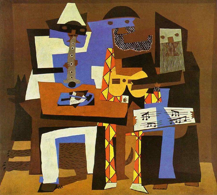
Pablo Picasso, led the cubism movement in art history. His works contain various paintings, drawings and sculptures. Picasso is one of my favorite artists for his bright colors and “cube” figures. Picasso would be a great example to showcase to students in terms of texture, rhythm, color and sound. Picasso was not heavily influenced by music, but he was influenced by politics and his surroundings.
Picasso’s Three Musicians